UniCart
UniCart is a browser extension tool that makes shopping a one step checkout process.
View UniCart PrototypeUniCart is a browser extension tool that makes shopping a one step checkout process.
View UniCart PrototypeWith the internet being easily accessed, I noticed that more shoppers started to make online purchases. It was easy for users to conveniently open up multiple browser tabs to different retail stores at one time. However, I wanted to explore ways in which a user can have an easier check out process without having to resubmit their information over and over again.
UX Designer
Research, Information Architecture,
Interaction, Visual design & testing
Jan 2020 - Mar 2020
With the e-commerce platform growing, I noticed that most shoppers were transitioning into online shoppers. With how easy and convenient online shopping is, it only takes one click to open multiple browser tabs to different retail stores. However, is there a simpler way for shoppers to check out their carts without having to resubmit the same information over and over again?
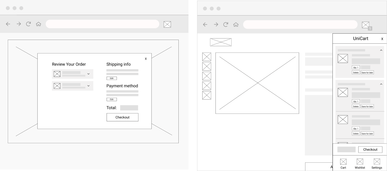
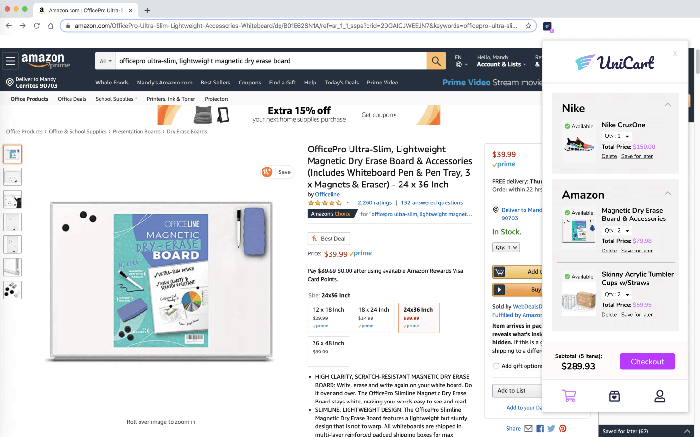
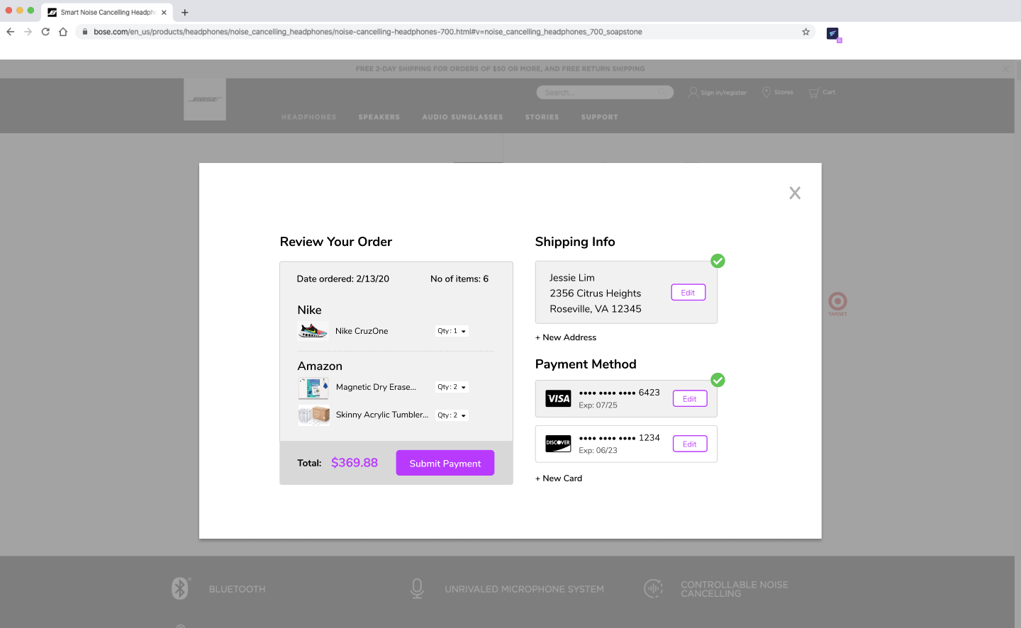
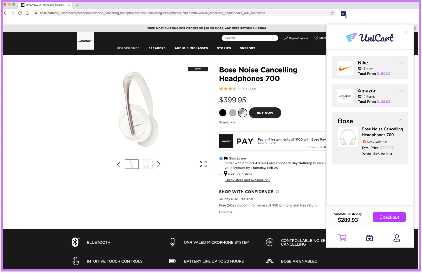
Browser Extension Tool: the tool is non-intrusive and can be accessed easily from the shopper. With each item added to a cart from a retail store, UniCart populates the same exact items into its own cart.
One Step Checkout: Once shoppers store their payment, shipping, and billing information into UniCart, UniCart uses the information to charge all retail website stores all at once.
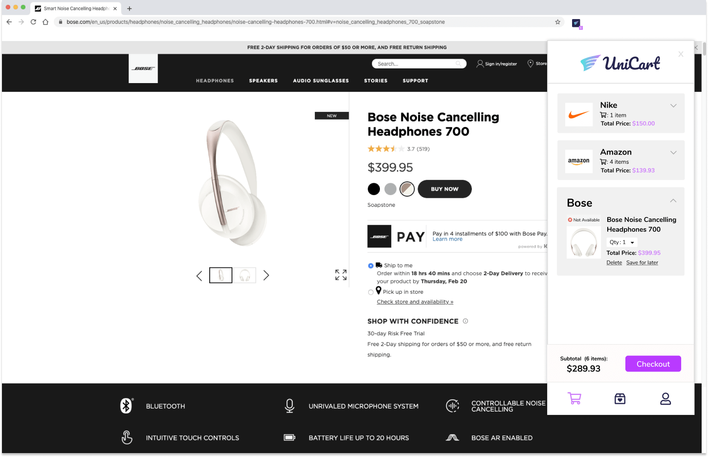
Wishlist: UniCart tells users the availability of an item. If items are out of stock, users can choose to save the item into their wishlist.
I started the project off by learning more about my user’s experiences with online shopping and browser extensions. Understanding a user’s behavior would help me have a clearer idea of the features that I needed to include in UniCart.
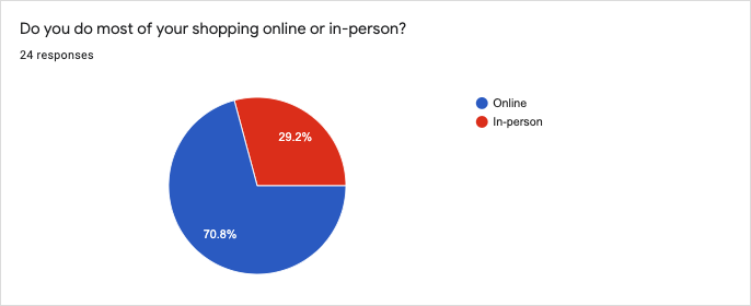
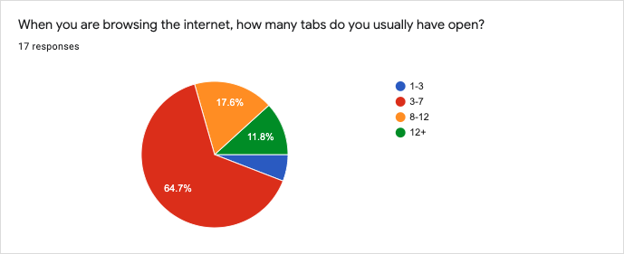
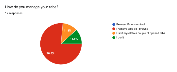
I created a user survey to obtain quantitative data of my users. From the survey results, 71% of users preferred shopping online versus in person, and that during their browsing sessions, usually 3 to 7 tabs are opened at a time. When it came to browser management, users said that they removed tabs as they browsed. The reason why users chose to shop online versus in person is because online shopping is convenient, websites are available all the time, and there’s an easy checkout process.
Apart from the positives of online shopping, I was also curious about the negatives of online shopping. Users complained that the quality of their items were not up to part with their expectations, and others complained about the checkout process and returns. This inspired me to look into solutions that could help simplify the checkout process for my users.
The next section of the survey was to understand user experiences with browser extensions. On a scale of 1-10, participants were asked to rate how important browser extension tools were to them. 47% of users gave browser extensions a six. From these experiences, I wanted users to speak about their positives and negatives with these tools.
“AdBlocker makes my entire online experience more enjoyable...”
“...the same/worse discounts that were already offered”.
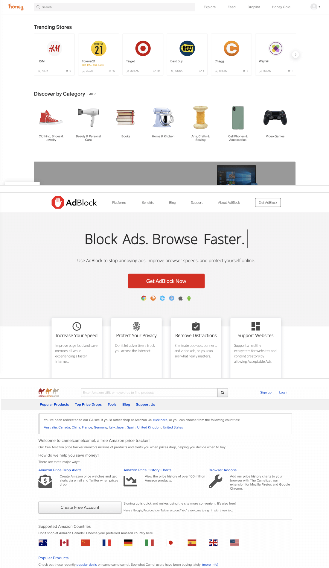
After doing user research, I went onto doing market research. The three competitors that I looked into were Honey, Adblock, and CamelCamelCamel.
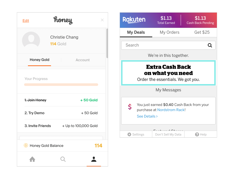
Honey: Honey is an online coupon extension that works on both desktop and mobile. It helps users find and apply coupon codes to users when they are ready to check out. They have a simple and clean and makes it easy for users to navigate around. However, Honey’s mobile application doesn’t provide the same experiences that their browser extension does. Therefore, most users avoid using the mobile application.
AdBlock: AdBlock focuses on providing a worry and distraction free internet experience for their users. It is free to download and works on multiple devices. However, AdBlock doesn’t necessarily block all ads. For a fee, AdBlock will allow certain third party ads to be shown. Also some websites have now made it possible to deny users access to their website if they have their AdBlock on.
CamelCamelCamel: CamelCamelCamel provides data to users on the price history of their products. They provide user’s information on the best time to buy products. However, they only track the prices of products that are sold on Amazon, and don't directly link users to third party sites to access cheaper products. It has a poorly designed landing page that may have users think that their website is not a credible source.
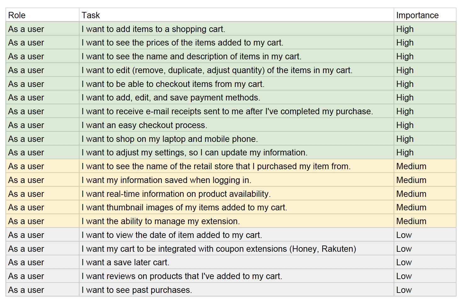
The research gathered from my users and competitive analysis helped me build out a collection of user stories for UniCart. I organized the stories from high, medium, and low. The high prioirties would establish my MVP for UniCart.
The next step was to create user personas that would serve as my potential audience for UniCart.

Motivation
Mia doesn’t shop much. The only time she does is when she sees email/instagram ads with deals, or when her family sends over links in their group chat. Mia likes to shop at the comforts of her home, but dislikes how sizes for clothing sites are not consistent. When shopping online, Mia likes to delete tabs as she shops. When she visits her favorite online stores, she wishes that her contact, shipping, and payment information is all saved, so that she can do a quick checkout.
Frustration
Having to fill out information over and over again, information is hard to read during checkout, sizing and quality of products are not accurate.

Motivation
Oliver loves to window shop online. He doesn’t particularly enjoy shopping in-person because there are never things that he actually needs. He enjoys shopping at his own time and pace. Oliver is all about costs, so he only makes a purchase when he knows that it is the best deal he can get. Sometimes it will take Oliver a day or two to fully commit to purchasing an item.
Frustration
When products are no longer in stock during checkout, purchasing an item and finding a better price elsewhere.
After understanding my users and marketspace, it was time to take my user stories and build them into user flows. The user stories helped me prioritize main features that would be included in UniCart.
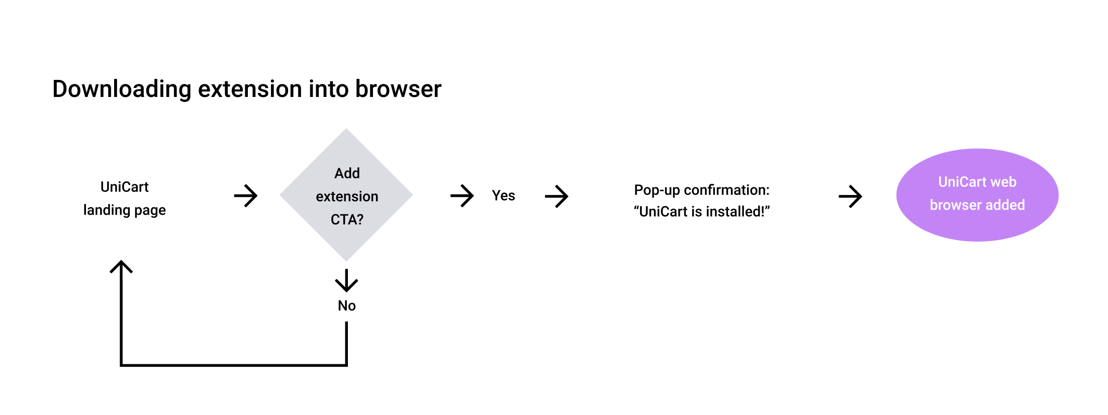
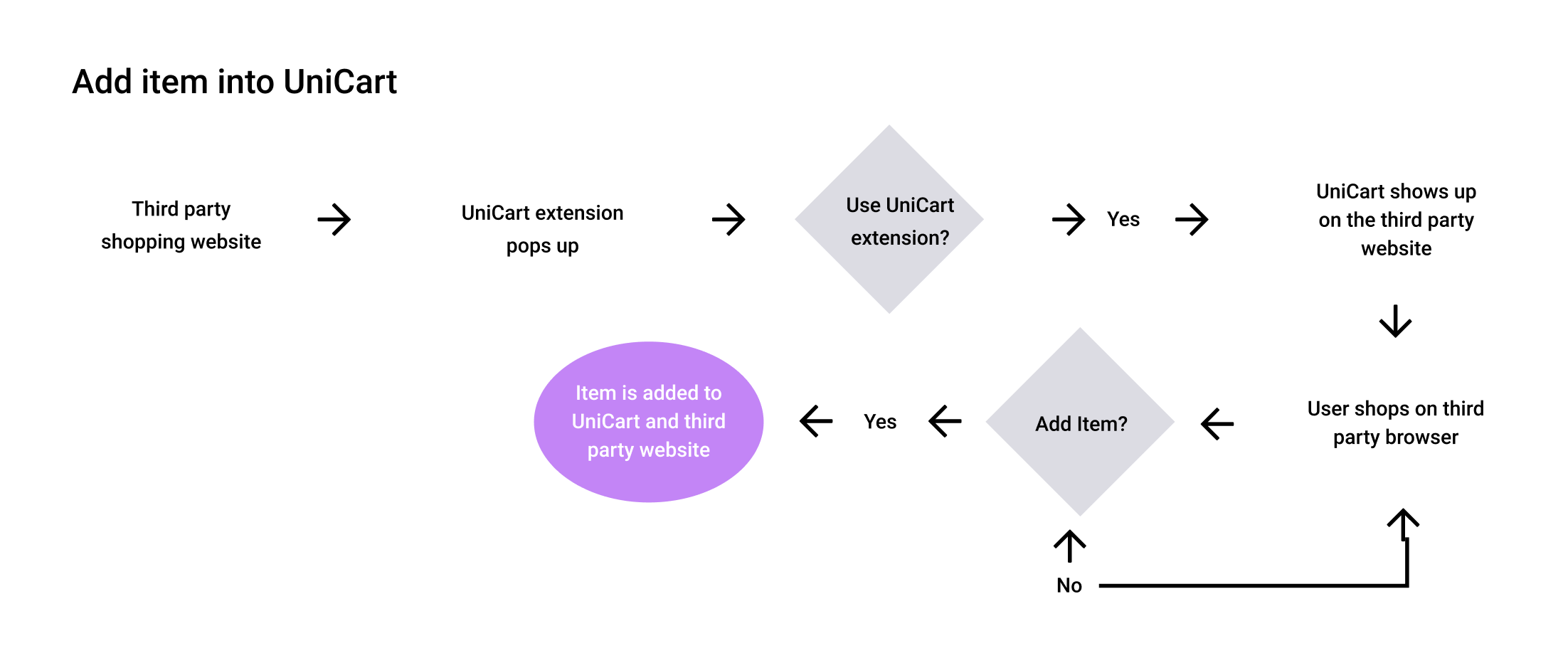
These user flows established a direction to begin sketching out how these screens would look like. I sketched out different layouts and redrew the best ones into FIgma.
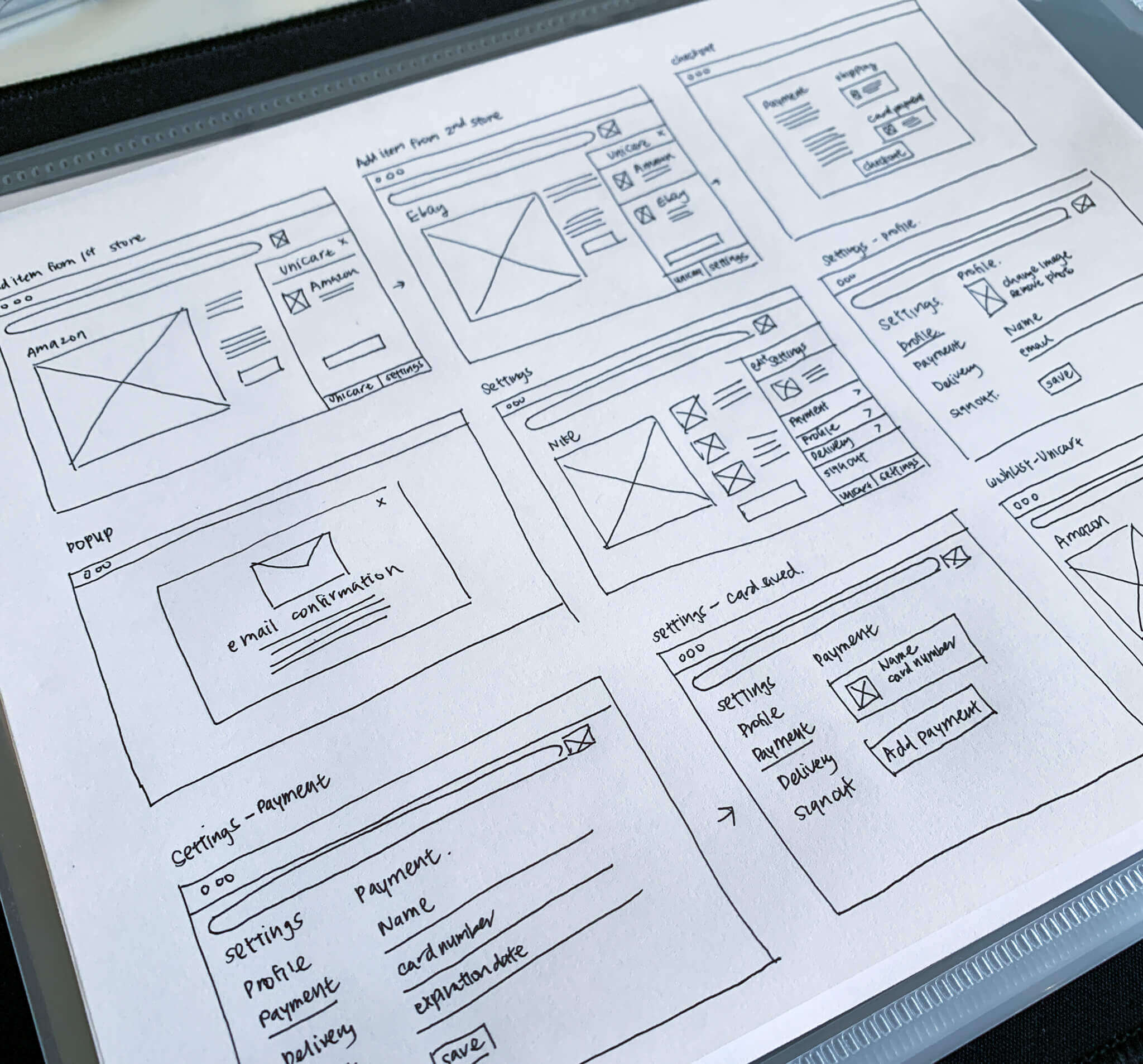
The wireframe mock-ups provided a clearer vision of how users would engage within UniCart. Due to UniCart being a browser extension, I explored moments in which UniCart would only take a partial of the screen versus a full screen.
UniCart’s name was inspired by the overall functionality of the browser extension. I wanted the name to be unique, yet informative of what the browser extension did. Therefore, I merged two words together “Uni” and “Cart” to form the word “UniCart”. The prefix “Uni” meaning one and “Cart” explaining what the tool does. Therefore, UniCart would come to be seen as a master shopping cart for online shoppers.
With the initial mockups of the logo design, I wanted to create a visual that merged unicorns and a shopping cart together. I liked the play on words that a unicorn could have with my brand name and wanted to reflect the unique/mystical attributes of unicorns into my logo design. The logo was to come off as useful with a dash of fun. However, as I began to flush out ideas for creating hybrid design, I noticed that the logo started to appear too child-like. I decided to go away with merging the two, and wanted to focus my logo design to a certain attribute of unicorns. Wings were a great metaphorical signifier of the mystical creature and how this tool could help shoppers make their online shopping purchases with ease.
The color palette of UniCart was highly influenced by the icon of the wing. I wanted the brand to look and feel whimsical. I began by looking up visuals of unicorns and stumbled upon a lot of purple, pink, blue, and rainbow gradients. I moved forward with having UniCart’s color palette feature a purple accent. The color purple was often tied with royalty because it was a color that was not seen much in nature. I thought this to be a great tie in with my overall branding and logo design.
With the branding complete, I was able to start working on my first set of high fidelity mockups. The idea behind the first draft of the high fidelity mock-up was to give an accurate representation of how UniCart would be used from downloading it on the Google Store to the tool being used with different retail browser stores.
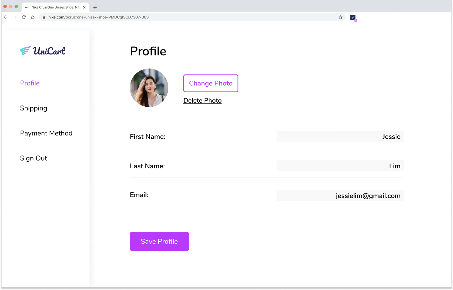
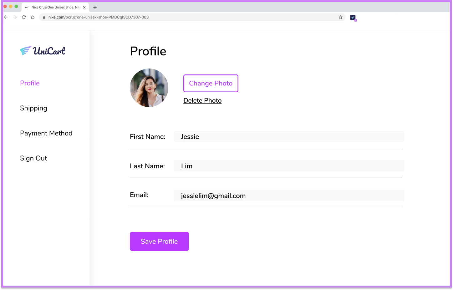
Some of the challenges in creating the first mockup was figuring out when I would obtain information on the user. The nature of browser extension tools are that they could be used automatically once a user downloads them, therefore there is no actual onboarding process. I looked at competitors to see how they were able to gather information from users. For Honey, they have a reward system called Honey gold that gives users gift cards for being an account holder. Rakuten works the same way, in that account users are able to earn cash back in the form of a check.
From these competitors, I was able to design a screen called profile that would be where users placed their shipping and payment methods. In order to protect the privacy of users, I required them to create an account with UniCart.
I tested my initial design with three participants that were all active online shoppers. In the usability tests, the participants had to accomplish six tasks with little to no guidance on my end.
Task 1: Download the browser extension tool, UniCart.
Task 2: Add items from different stores.
Task 3: Checkout your items.
Task 4: Move items that are unavailable in stock into wishlist.
Task 5: Create profile account.
Task 6: Edit profile info.
The testing results showed that all participants were successful in completing all tasks. However, there were comments made about the prototype that I would incorporate into my final mockup.
When I download the browser extension, I want to see a progress bar or notification that the extension has been downloaded.
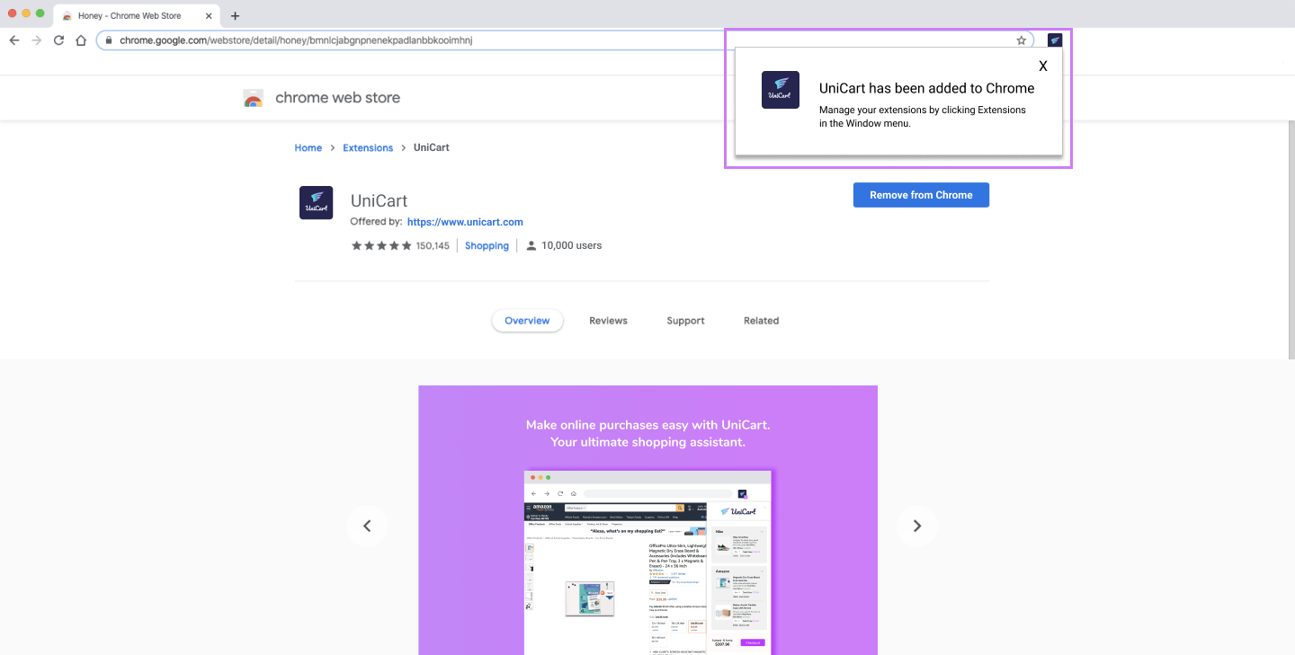
With my original design, when users clicked on “Add browser extension”, it would automatically populate next to the address bar. However, the browser extension tool is just a small icon and may not be obvious to users that the tool had been downloaded. Therefore, with my revised design I added a pop-up box next to the browser extension to show that the tool is now active and ready to use.
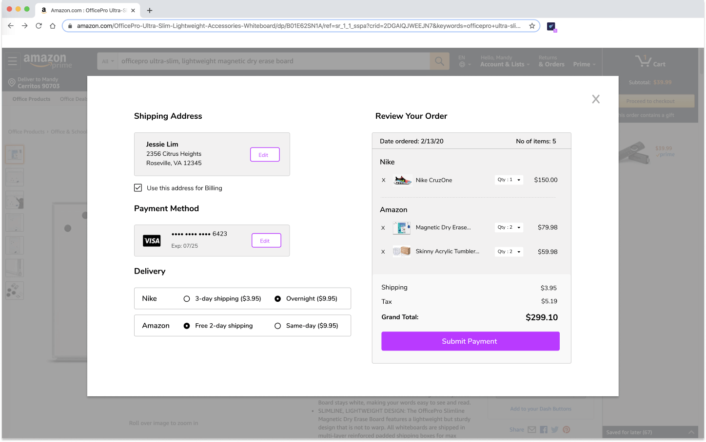
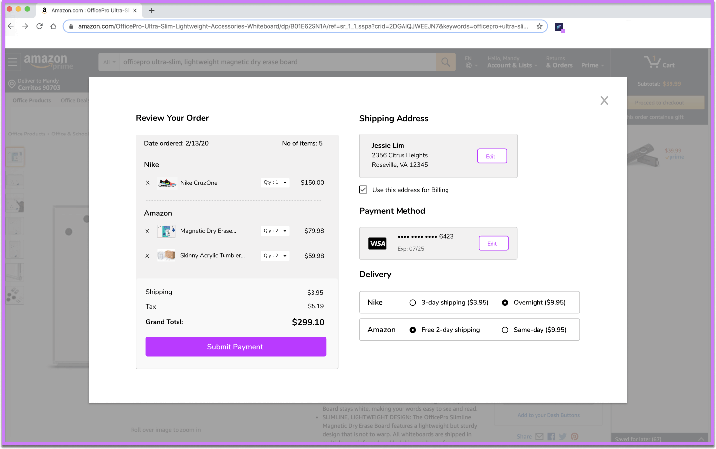
During the checkout process, users said that there was information missing from the design that they would normally see during checkout. They wanted to see the prices of items, delivery options, and shipping/tax fees to give them a grand total.
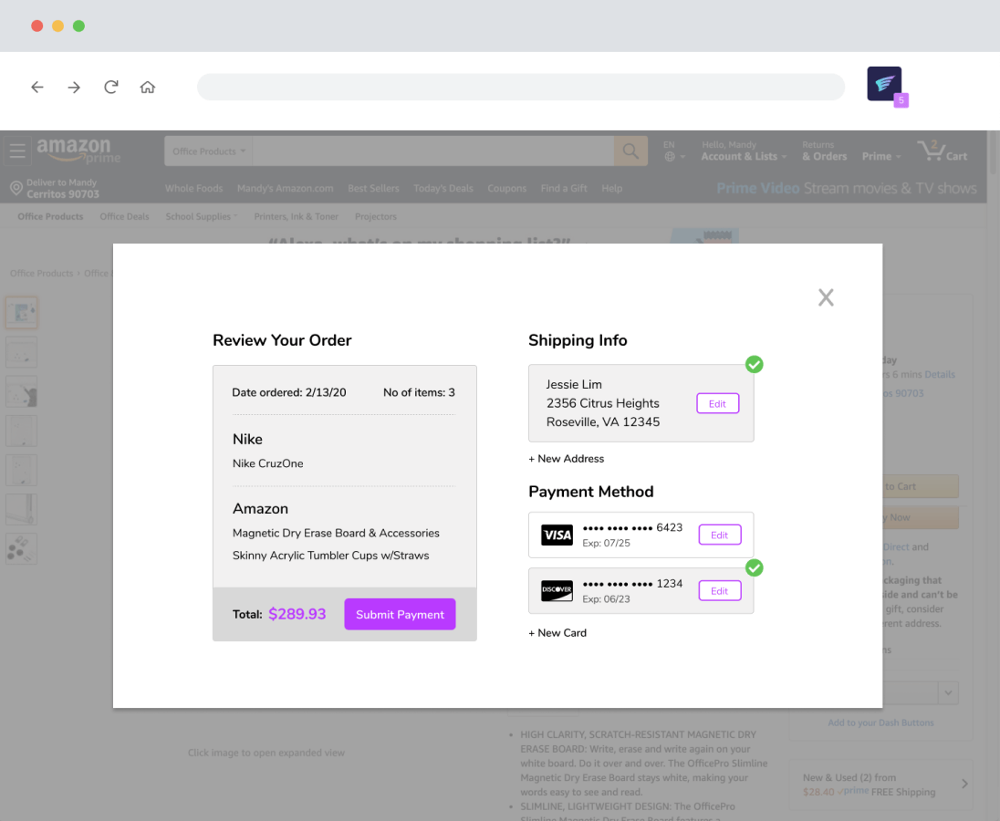
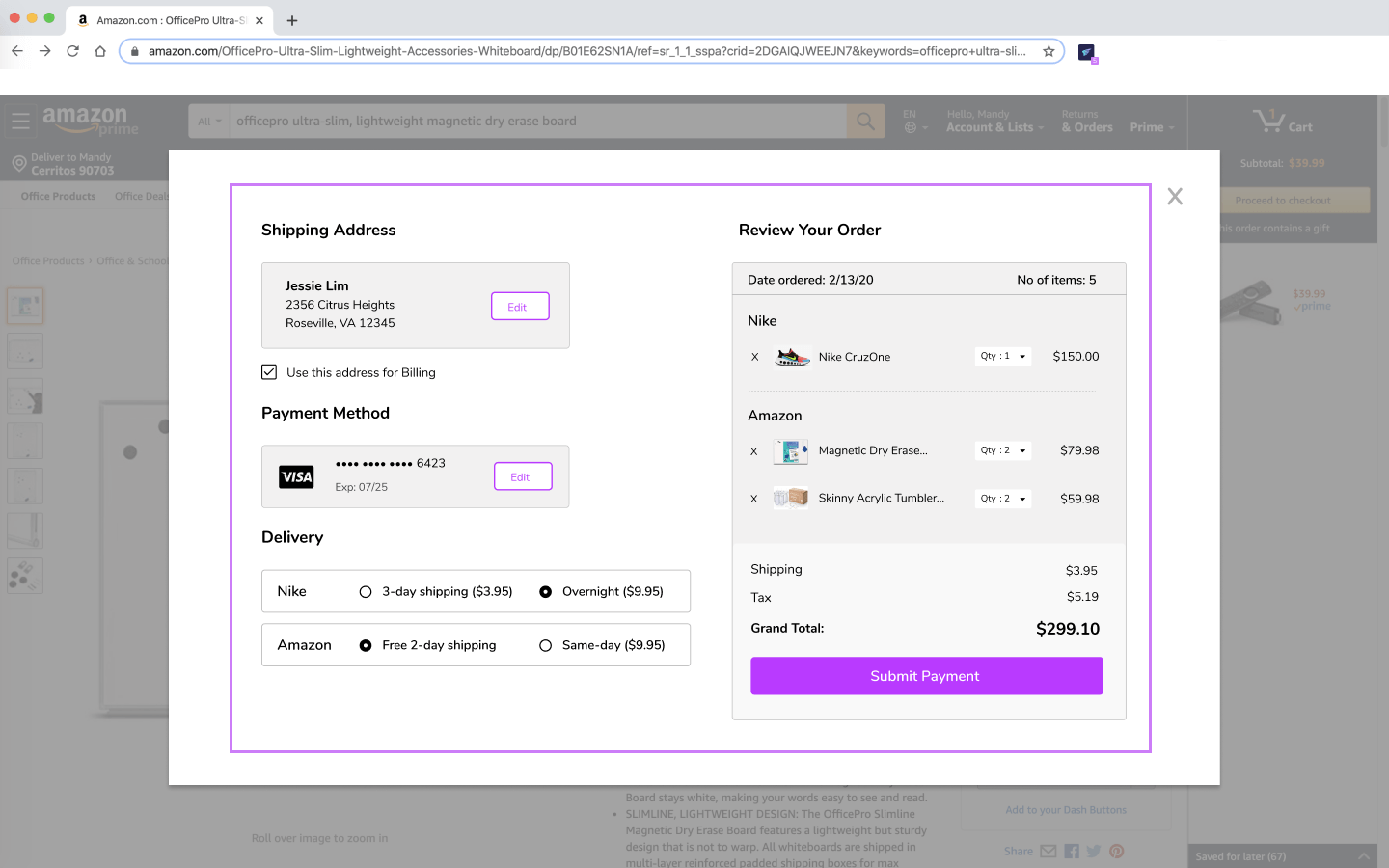
Due to the extra information added, I had to make the light box modal longer. I reviewed the information placed on the original screen and saw that the information seemed backwards. Information is read from left to right, with the right being where the user’s eye would end.
Having received feedback on my final designs, I worked on making revisions to screens. With these revisions, I wanted to test them out to users to see what layout preferences they had. The three tests that I had users test for was how information would be displayed during checkout. How input fields should look to users, and how an item’s status should be shown to users.
Which layout do you prefer? 67% of users chose the second design.
Which input field is preferred? 100% of users chose the second design.
Which item status is preferred? 100% of users chose the first design.
From the preference tests, I would apply these changes into my final design mockup of UniCart.
Overall, I believe I successfully captured the MVP of UniCart. It was a great side project that I was interested in working on. I was able to find a solution to the mildly annoying checkout process of online shopping. The reason why this project is successful is because I was able to involve all high priority user stories with the addition of some medium and low stories. UniCart has proved as a solution in how it only takes one cart for a user’s shopping experience. However, what I think I could have done better is to fully grasp the origins of where this extension came from. Because it is part of Google Chrome Store, I needed to be mindful that users should be given the choice to sign in with their gmail account, and also if users shared their credit card information with Google they should also be able to use it as a form of payment within UniCart.
In future iterations of the product, I would like to allow users the ability to add different payment methods for different retail stores. For example, if a user’s Visa card had a cashback on 5% department stores, then the user would be able to use that Visa card specifically for items that are from department stores. I also would look to integrate UniCart with the browser extension Honey, so that it can have coupons added to items in the checkout. I think this will definitely make UniCart a valuable tool for all online shoppers.