BusyBus
BusyBus is a local transit app that helps thousands of commuters get to their destination.
BusyBus is a local transit app that helps thousands of commuters get to their destination.
With more and more locals taking public transportation, the local transit system has decided to expand the number of bus lines at each stop. However, with the added lines, riders were now unsure of when their bus would arrive. My job as the UX Designer was to come up with a solution that would provide information to users to help them easily navigate through local transit systems.
UX Designer
Research, Information Architecture,
Interaction, Visual Design & Testing
Jun 2019 - Jul 2019
Transit officials have identified a problem. Due to expansion, numerous bus routes have been added and many of those routes stop at the same bus stop. Riders want to know what the next arriving bus is and how much time they have to get to a bus stop.
The specific stop that I was solving for was the bus stop on Washington and State, which currently has seven bus lines running there.
Visual Map: the visual map identifies the current location of the user, and shows all bus stops surrounding the user.
Live Traffic Updates:when users inputs which bus they would like to take. BusyBus will provide live traffic notifications on the status of the bus.
Bus Schedule:once a user identifies their bus location. A list of buses that runs through that stop will be shown.
As a local from Los Angeles, I was unfamiliar with how public transportation worked. I had to find friends/colleagues that were located in San Francisco to understand how they used public transportation. I put together a survey and sent it out to this audience. A majority of the survey questions consists of asking how long the participant had been using public transportation. What were the pros and cons to using a public transit app? The results from my survey helped me better understand how public transportation is used from their perspective. I was also able to have a better idea of the user’s wants and needs for their preferred local transit app. From the results, I found out that about 50% of participants used public transportation twice a week and 23% used it five plus days. The main reason to using public transportation was due to work commutes, affordability, and convenience.
In the survey, I asked about struggles that users faced with public transit apps. 27% of users said navigation wasn’t always accurate, 18% said buses were oftentimes never on time, and lastly a lot of features were buried within tabs.
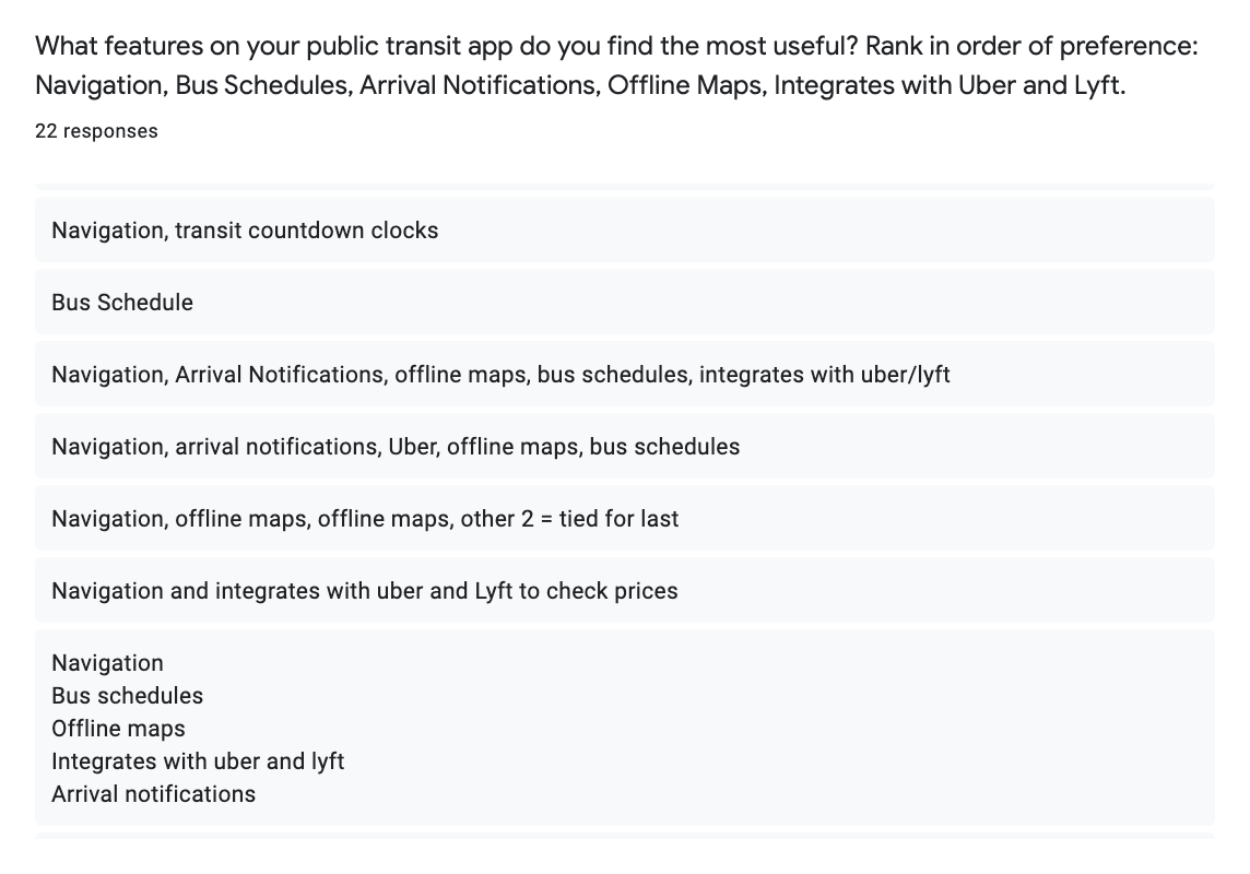
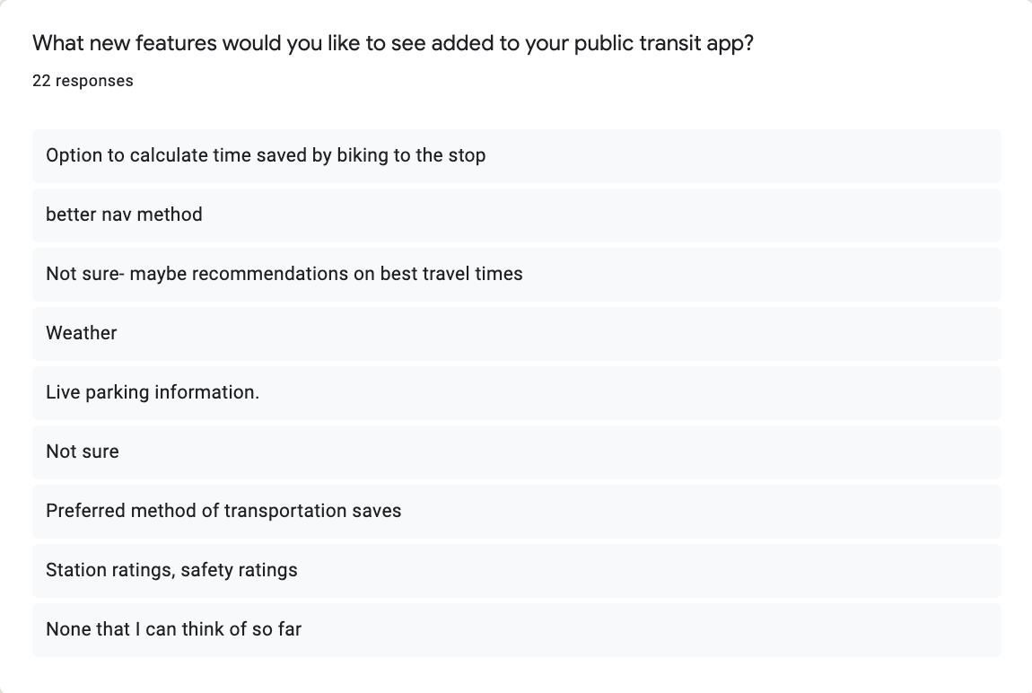
I was curious to what features were important to participants, and had participants rank from most to least importance a list of features that I had given to them. These features included: Navigation, Bus Schedules, Arrival Notifications, Offline Maps, and Integrations with Uber or Lyft. 55% of participants placed navigation as most important, which was followed by 32% of participants that said bus schedule. Towards the end of the survey, I asked users to name features that they would like to see in their local transit app that they currently didn’t have. Users said that they wanted to obtain live traffic notifications on the status of their bus, and that it would be neat to have photos of bus stops to confirm their end destination.
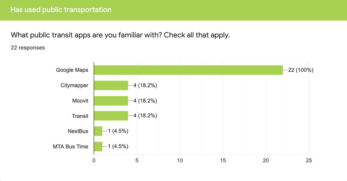
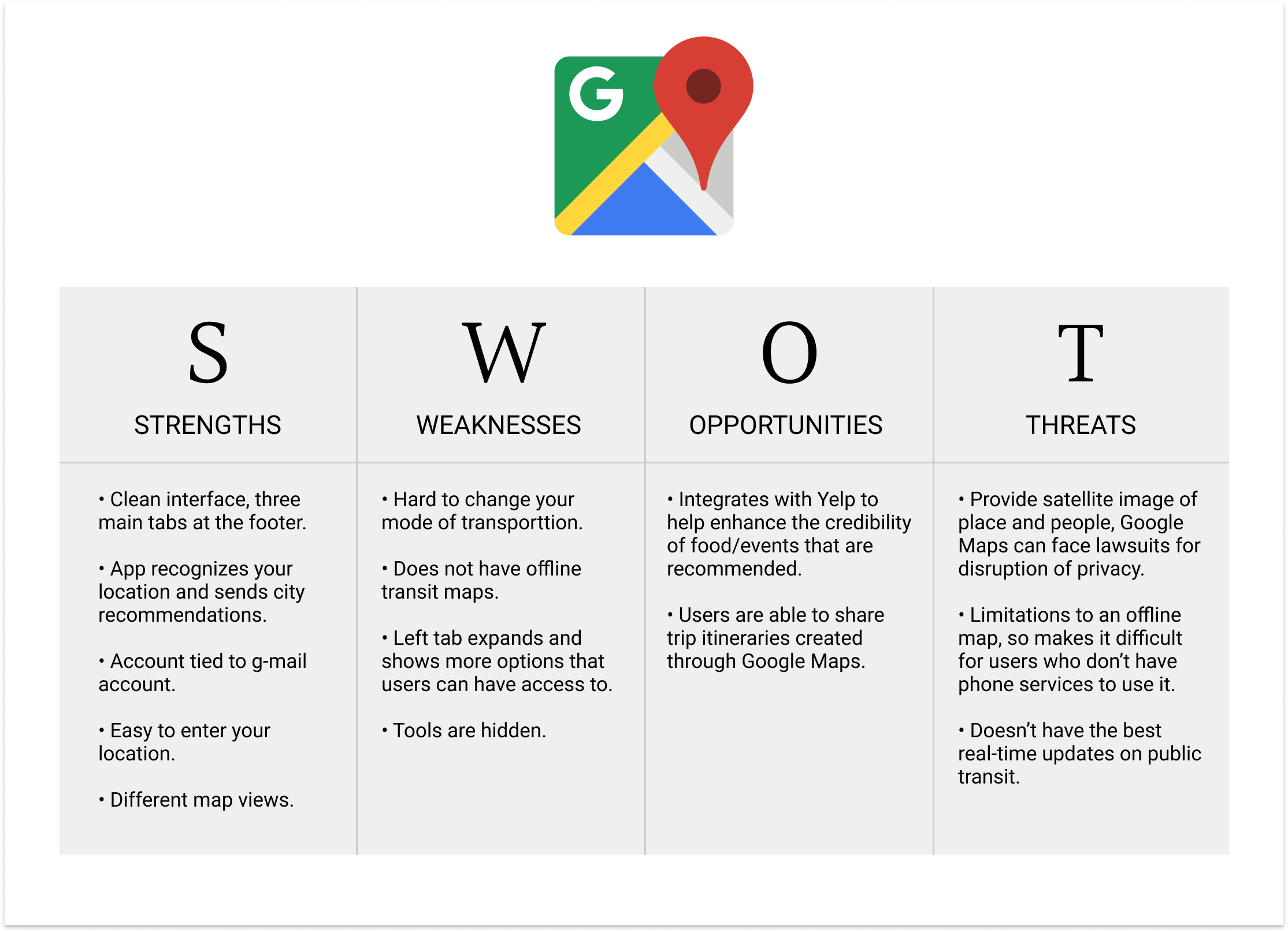
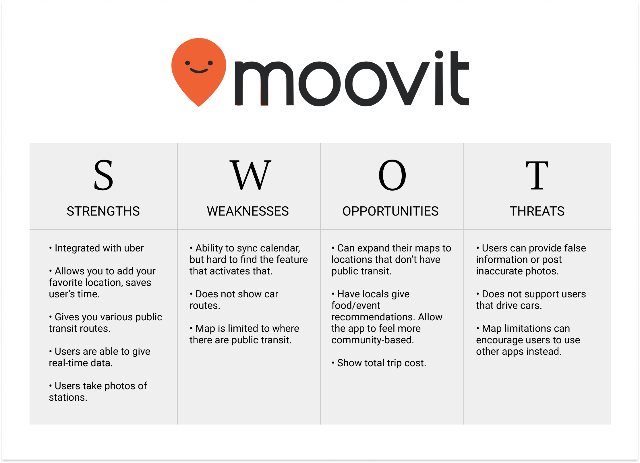
After having a better understanding of my participant's engagement with mobile transit apps. I did research on competitors within the marketspace. From the survey, I asked participants which mobile transit app did they use? The top two that stood out was Google Maps and Moovit. I started doing a SWOT (strength, weakness, opportunity, threat) analysis on these competitors. I noticed that Google Maps worked on providing an atmosphere of community. Google Maps could recognize the whereabouts of the user and offer local recommendations for food and shopping nearby. I believe Google Maps focusing on getting the most from your journey. Moovit, on the other hand, focuses their app on bus transportation. They too have also built a community for themselves. They allow users on their app to send real traffic updates. The community here are bus transit users. Moovit also allows users to post images of bus stops.
Despite some of their differences, there were some common similarities that I noticed in researching the two. Both apps home page showed a defaut of a user’s location, features in the app were usually buried within tabs, and navigation was bias towards a specific source of transportation. Google Maps focused on car navigation, whereas, Moovit only supported navigation with bus users.
For BusyBus to enter the marketspace, I needed to create a feature that would send instant notification updates to their users on bus schedules. BusyBus also needs to send users daily real time traffic updates on when their bus/trains were arriving. Since the primarily mode of transportation for BusyBus would be local transportation. For future feature improvements, I want to provide images of bus stops and navigational maps in metro stations to BusyBus users. As stated in the struggles with participants, I recognized that public transportation can be convenient and affordable, however, it can also be stressful. Therefore, I want to provide these features to users so they can view BusyBus as a helpful tool.
Having gained a better understanding of my users and marketspace. It was time to create user stories and user flows. In my sketch, I wanted to incorporate the results from my survey and market research to create user stories.
I want to be able to get from point A to point B”
“I want to view bus schedules”
“I want to receive notifications on my bus”
“I want to see a map with my location and bus location”
“I want to be able to easily navigate within the app”
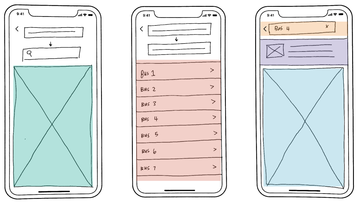
The above sketch shows a low-fidelity mock up of how BusyBus would look like. The first screen would show a map of the user’s current location. The input fields on top will be where users fill our their location and where they would like to go. Once both fields are filled out, BusyBus will find the bus stop closest to the location , and show all the buses running at that stop. Users select which bus they want to take, and BusyBus will show the location of the bus in regards to the user’s location. Live notification updates will be shown above the map that tells users the whereabouts of the bus.
I wanted to see if the flow of my screens would be understood with the user. I tested the three screens above with in-person interviews. I interviewed four participants who used public transportation and were familiar with public transit apps. From the interviews, I saw that participants were able to talk me through the screens. Overall, they were able to understood the flow of the screens, and could tell me a general idea of the functionality of each screen. However, some users were unfamiliar of what an image placeholder looked like. Users also wanted to see more information on bus lines, such as the frequency of buses. Lastly, participants were confused on what bus notifications for the third screen meant. They believed that that container stored the address of the bus stop.
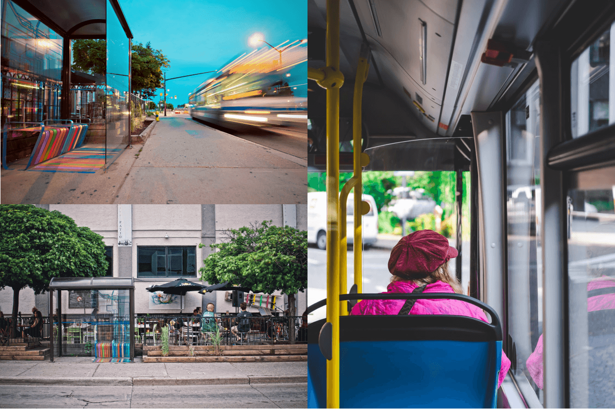
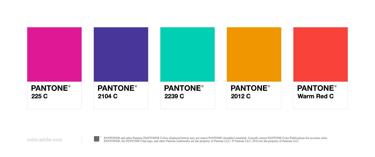
The initial steps for branding BusyBus was to find photos for inspiration. I used a website called pexel.com. In these photos, I wanted to observe colors that were used. I from the market research done that BusyBus had to have a clean interface. From the photos that I decided to keep for my mood board, I noticed there was always a splash of neon color. I loved how urban the scene look. Therefore, the accent color that I decided to move forward would be the turquoise green. I liked how it can easily be interpreted in different ways. For a product pertaining to public transportation, the color green could reflect how BusyBus is eco-friendly. The same green can also used to show if a bus line was active or not.
With my original design concept of BusyBus, I thought that by assigning different bus lines its’ own color, that would help users establish that these bus lines were different. However, as a I looked at it from afar, I saw that it was hard to read some of the fonts and would not be user-friendly for users that are color blind. Also, the overall design looked distracting , and it clashed with my accent green color. Therefore, for the next iteration of my design, I looked into simplifying the design by making all bus lines the same color.
The next step in the process was being able to create a prototype of what I had designed. The initial problem I was solving for was to create a screen where users would be able to find when their certain bus was going to arrive, which in my case was on Washington and State. I wanted my prototype to look as real as possible, therefore I adjusted the copy so the information looked accurate. In my screen, I divided bus line information into four columns. The first one being the name of the bus line, the second, the destination that the bus stop was located at, the third was how often the bus arrived at the stop, and fourth was the arrow that signified to users that when users selected the line, it would take them to the next screen. With the excessive amount of information given, I had to label the information, so that users would be able to take a quick look at the screen and be able to digest the information given to them.
For BusyBus to enter the marketspace, I needed to create a feature that would send instant notification updates to their users on bus schedules. BusyBus also needs to send users daily real time traffic updates on when their bus/trains were arriving. Since the primarily mode of transportation for BusyBus would be local transportation. For future improvements, I want to provide images of bus stops and navigational maps in metro stations. As stated in the struggles with participants, I recognized that public transportation can be convenient and affordable, however, it can also be stressful. Therefore, I want to provide these features to users so they can view BusyBus as a helpful tool.
After completing this project, I believe that there is still other screens that I can solve for with BusyBus. However, I believe that I was able to create a screen that was able to solve for local transit riders. I created a screen that showed the whereabout of the user to correspondence to bus stops near their location. I created input fields so that users can search up a location, and view the bus lines that run in that area. I also provided users live traffic notications of buses.
In order to improve on this product, I want to provide photos and indoor metro maps so that users can have an easier time getting to their desired destination